Web Design is a requirement to capture the attention of the visitors. Web designs are hosted in different configurations of Web Hosting such as shared hosting, dedicated hosting, and virtual private server. A beautifully designed website has recurring visitors. As long as the website looks pleasing to the visitors, the visitors keep coming back to the website.
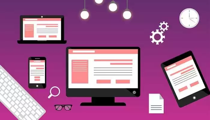
The field of website design has achieved a new paradigm. With each passing day, new devices are introduced and people’s interaction with the internet happens through these gadgets. Each device has its own screen size and resolution. There is no defined size or resolution for the devices in the world.
This creates a problem with the website. More often, websites are designed for a particular device. These websites do not look good on the other devices? So, how do we solve this problem? Do we only target users using a particular device? Are you just happy with them? Don’t worry about it now. We have a solution.
What is a responsive web design?
Responsive web design is a process that adapts the website to the user’s environment and device including the screen size, resolution, and orientation of the device. This automatic adaptation is called as responsive web design. The ability of the website to automatically resize itself is called a responsive web design.
In order to achieve this, the intelligent use of CSS media query is highly required, including a mix of flexible layouts and images. When the user switches from one device to another, the website should switch to accommodate the new resolution or orientation. In simple terms, the website should have the capability to automatically adapt itself to the new device. This stops the trouble of creating websites for new gadgets every time.
What is the purpose?
Mashable dubbed 2013 as the ‘Year of Responsive Web Design’. A million screen have bloomed in this world. There is a need to build for all those screens. That is a herculean task. But with a responsive web design, the solution has been found.
Let’s take a traditional ‘fixed’ website that has three columns. When viewed on the desktop, the three columns appear without any distortion. When the same website is viewed on the phone, the user has to scroll across the screen because the website isn’t adapting to the new screen. The user is unhappy and you lose a visitor to your site. Sometimes, some of the elements on the website (like images or graphics) might also look distorted. Because the tablet is mostly seen in a portrait orientation, the impact becomes much worse.
Even worse is when the websites are opened on tiny smartphones. The images will not look pleasing to the visitors and if the graphics on the website is heavy, there are chances that the website takes a longer time to load. The graphics might be unsupportive on some screens and the experience turns out to be the worst.
However, if the same website is designed using a responsive web design, the three columns seen on the desktop would turn into two columns on the tablet. The user will not have the need to navigate on the screen. On a tiny smartphone, it becomes just one column. The images resize according to the screen and will not look distorted or cut-off.
How does the responsive web design work?
Responsive websites use something called as fluid grids. Fluid grids are designs that expand or contract with shear stress. The stress is provided by the device screens. According to the screen size, the fluids contract or expand, adapting itself to the device screens. The size of the elements on the page are based on proportions and not based on pixels like earlier. So, with a website having three columns, the size of the columns isn’t defined.
Instead, it will be more like how much space each column should take on the screen. Maybe column one should take half of the page, and the rest must take another half of the page etc. Since the elements and media are designed in such a way, the image or the element adapts automatically to the resolution or the size of the screen, giving a pleasant appearance.
Related Issues
Mouse vs Touch – This is the most common problem seen with the devices. The user uses a mouse when viewing the website on the desktop and to interact with it. But on a smartphone, the user cannot use the mouse but should interact using touch. Hence, the web designer should take touch into consideration.
Graphics and download speed – The issue of graphics, ads, and download speed is always seen when the website is viewed through mobile phones. It is important to ensure that the mobile version has lesser graphics and fewer ads to ensure the quick loading of the websites.
Why must small businesses switch to responsive web design?
There are more mobile phones and tablets in the world than the desktop computers. If you visit your website’s analytics page, you will find that most of the traffic will be generated from the phones and tablets than from the desktops. The behavior of people has changed when it comes to surfing the internet. Thus, it is highly important to create a responsive web design for your small business to drive traffic to your website and get business. You can also contact your web host for help in this segment.
